As a part of my Intro to Industrial Engineering class, I completed a data analysis project that began with the search for a reliable data set. My group ultimately selected a data set documenting tornado occurrences in the United States from 1950 to 2021. Using Excel and PowerPoint, we created four assertion-evidence slides to explore different questions related to tornado frequency, severity, location, and impact. Each graph was designed to support a clear conclusion based on the data, following principles of effective data visualization and storytelling.
The data set was comprised of numerical and categorical data for all recorded tornadoes in the U.S. from 1950 to 2021. Each row of the data corresponded to one tornado, and the columns for the dataset were as follows:
- year
- month
- day
- state
- EF level (magnitude)
- number of injuries
- number of deaths
- start and end longitude
- start and end latitude
- path length (miles)
- width (yards)
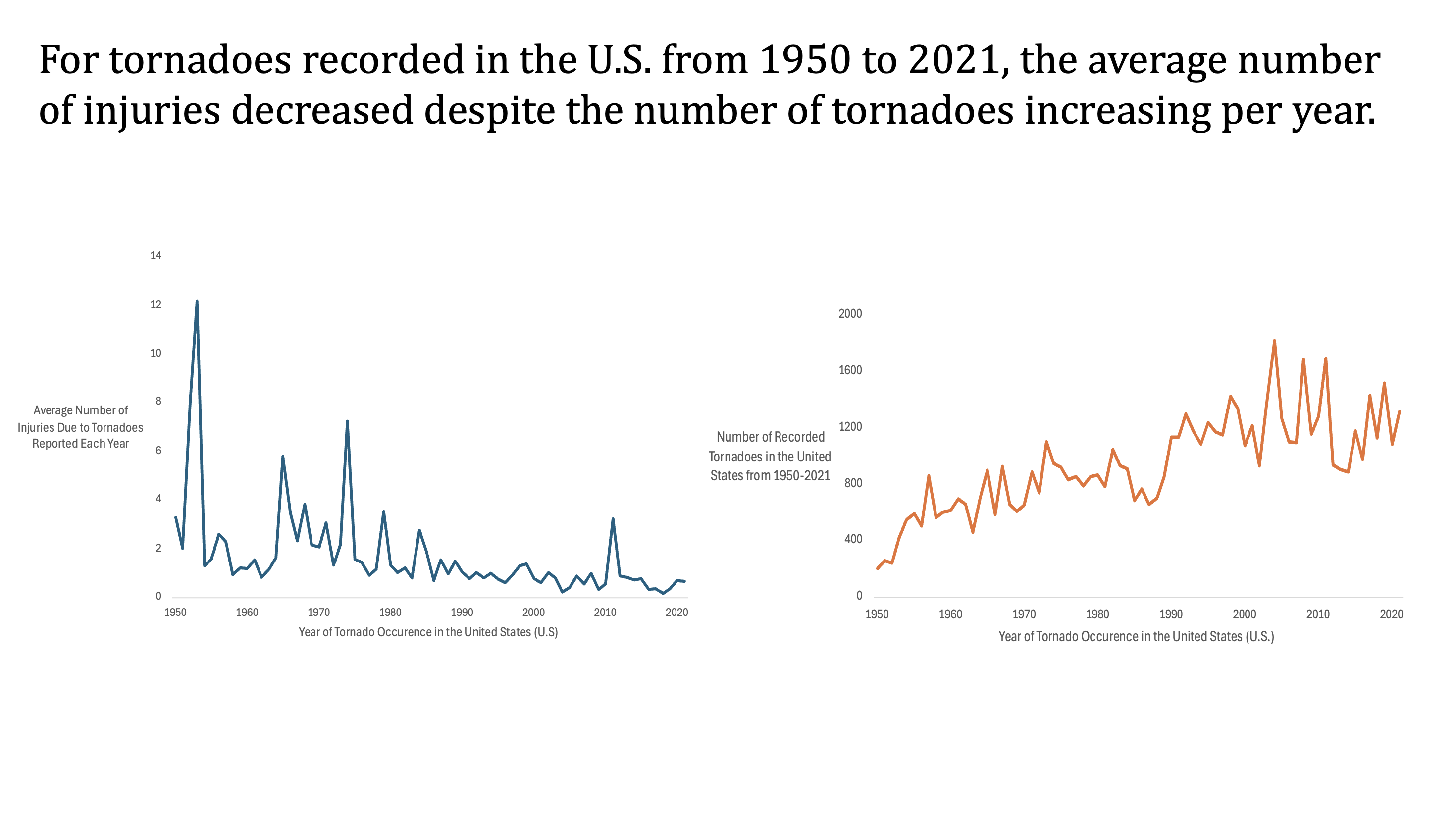
First question: From 1950 to 2021, was there a change in the average number of injuries associated with the number of tornadoes each year?
To answer this question, we used an Excel pivot table to determine the average number of injuries and tornadoes for each year. In this pivot table, we excluded all years that were recorded as “blank” in the original data set. From this data, we created two separate time-series plots. The first plot had average number of injuries on the y-axis, while the second plot used the number of tornadoes instead.
We added the chart to the PowerPoint slide below, and our conclusion, based on the plots, is that there is a clear inverse pattern between the two measures. Despite the number of tornadoes increasing steadily through the years (right), the average number of injuries were seen to decrease (left). This suggests improvements in tornado detection systems, public warning protocols, and shelter infrastructure.
All formatting was done in Excel, where we cleaned up the visuals by adding axis titles, removing the chart title, grid lines, and borders, and applying consistent styling across both charts for easy comparison. This was done for all the charts we created.
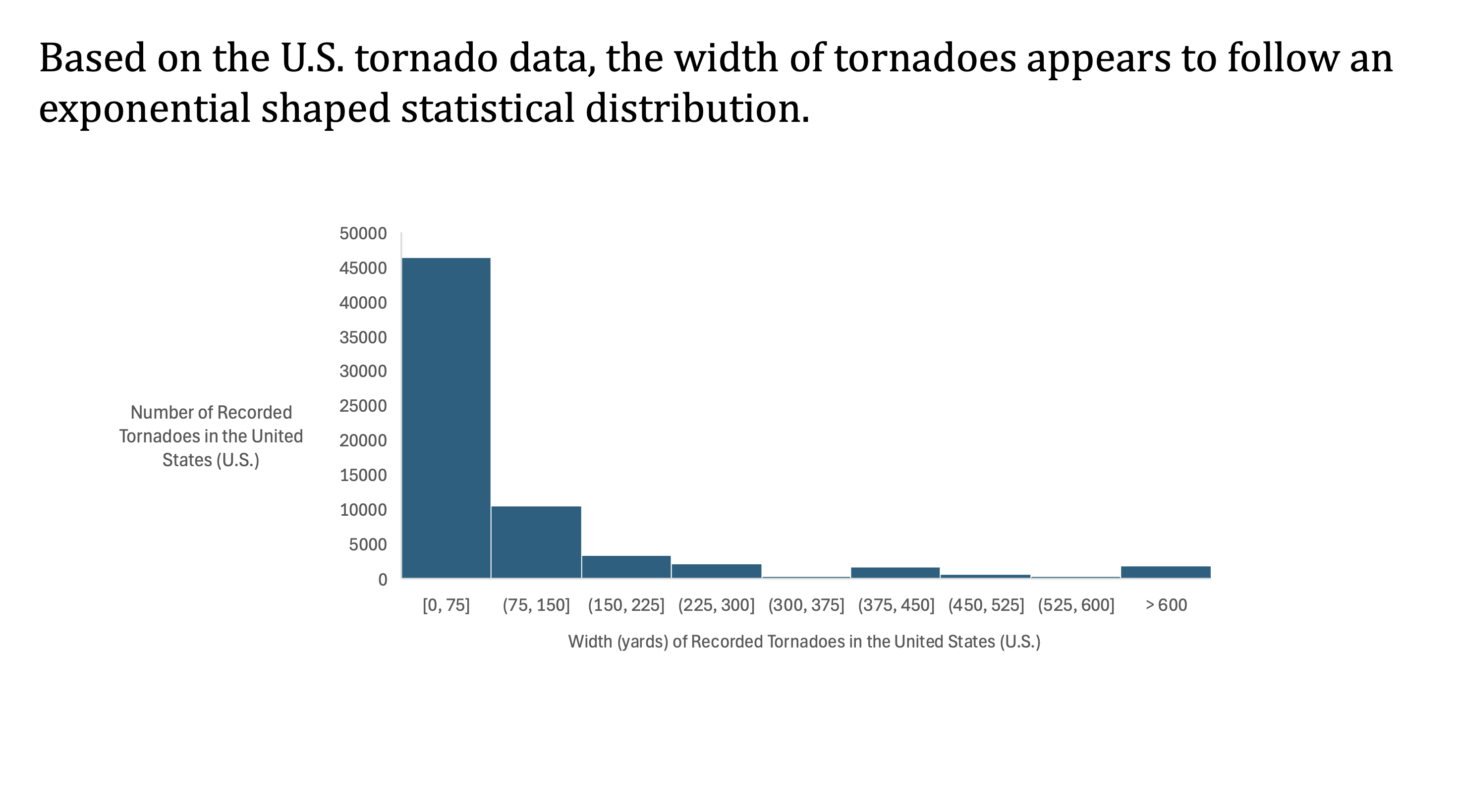
Second question: Historically, what is the distribution of tornado widths?
To investigate this, we created a histogram chart that demonstrates how tornado widths are distributed across the dataset. To create this chart, we used the tornado widths column of the data. Using Excel’s chart design tool, we set the bins to be in increments of 75 yards by adjusting the default bin size for better readability. We then added an overflow bin for the few extreme cases of tornadoes with a width greater than 600 yards.
The resulting histogram follows an exponential distribution (see below). The majority of tornadoes are under 150 yards wide, while only a small fraction exceed that. This pattern aligns with the expectation that smaller tornadoes are far more common, and therefore validates the data.
For aesthetics, we added the horizontal axis label directly in Excel, and the vertical axis title in PowerPoint since Excel doesn’t allow for horizontal formatting of vertical text.
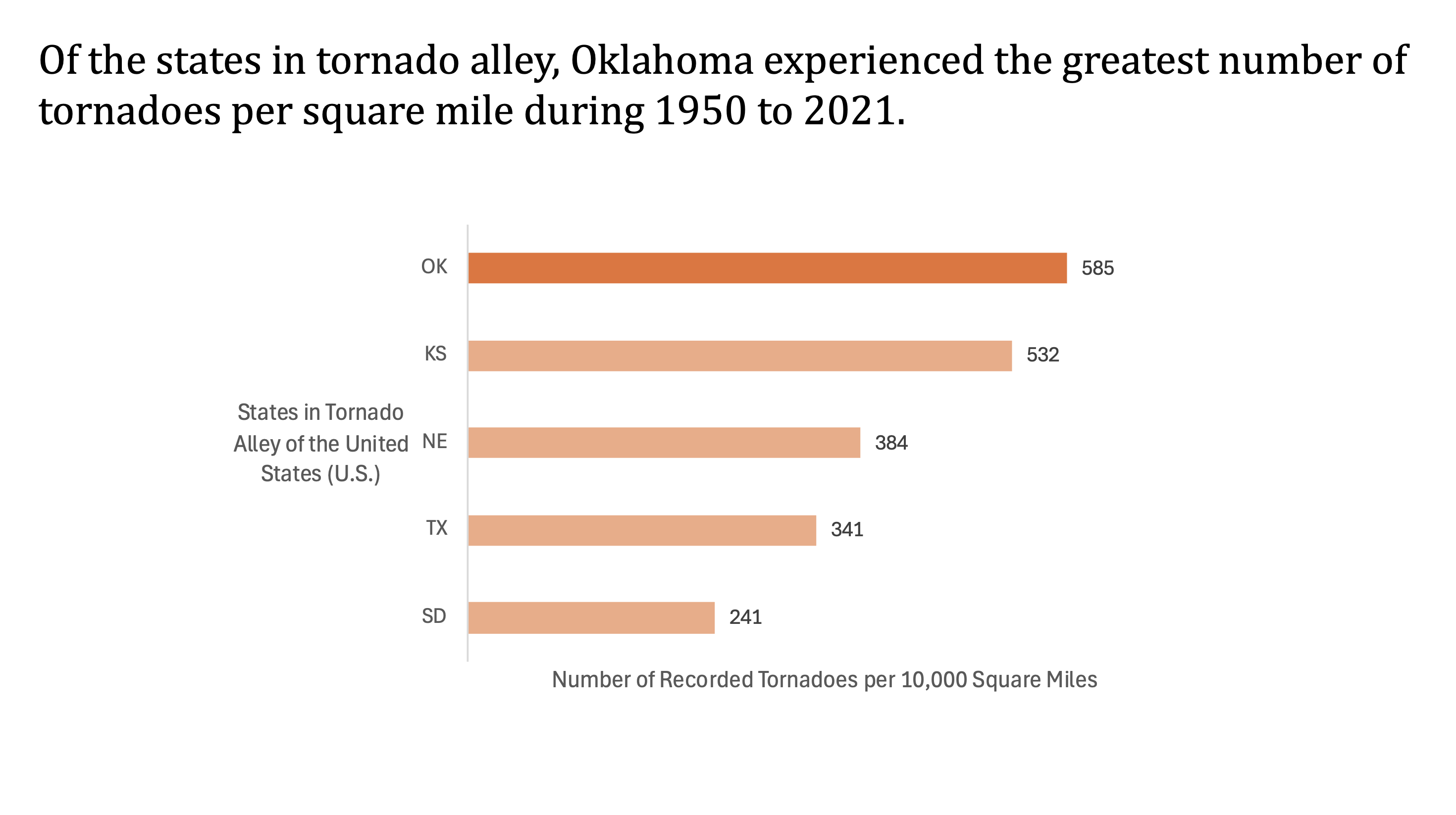
Third question: Do states in Tornado Alley show similar patterns in tornado occurrences from 1950 to 2021, or are some consistently more affected than others?
To analyze this question, we started by filtering the “state” column of the data to only show the states in ‘Tornado Alley’ (South Dakota, Texas, Nebraska, Kansas, and Oklahoma). We then used a pivot table to gather the counts of the recorded tornadoes for each of these states. To make this a fair comparison, we normalized the data by calculating the number of tornadoes per 10,000 square miles for each state, using publicly available land area data. Using this data, we created a bar chart.
The outcome proved Oklahoma to have the highest number of tornadoes for its size, with Kansas coming in close second.
The final bar chart was created in Excel with clearly labeled axes and bars shaded in similar tones, with Oklahoma highlighted to emphasize the key finding. We also rounded all values to whole numbers to reflect reality and added data labels for readability.
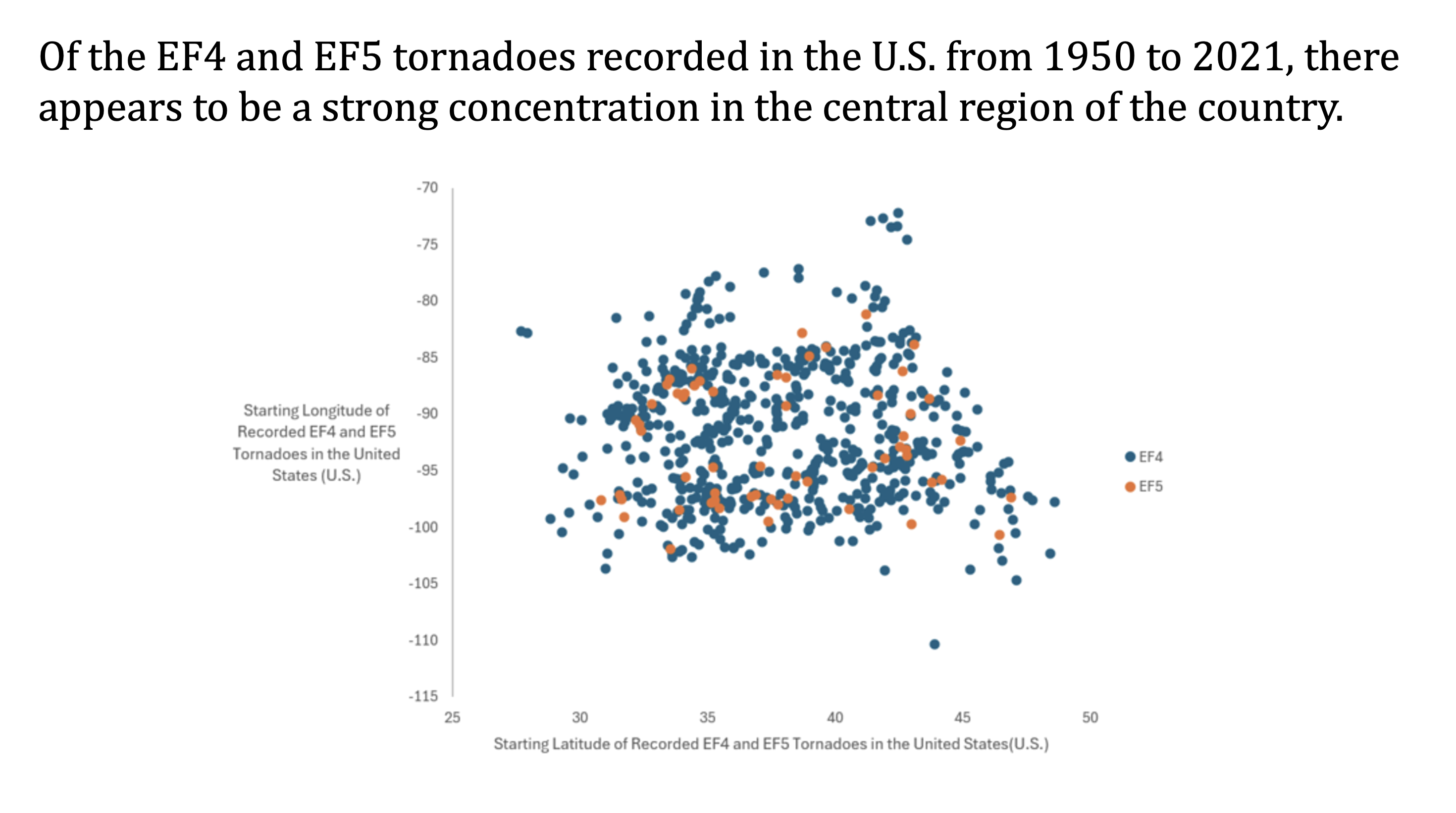
Fourth question: Is there a geographical pattern of the most deadly tornadoes (EF4 and EF5) recorded in the U.S. from 1950 to 2021?
In order the investigate this question, we filtered the magnitude column of the data to show only EF4 and EF5 tornadoes. We initially tried to use a pivot table but it proved to be cumbersome. Due to our data having the starting and ending latitude and longitude for each recorded tornado, we decided to choose just the starting locations (the touch down locations). Next, we copied the starting latitude and longitude columns (which were filtered by magnitude) and pasted them into a blank worksheet. From here, we simply highlighted the data and inserted a scatter plot.
We color coded the data points by EF Rating (EF4 in blue and EF5 in orange) to make differences more visible. The final scatter plot revealed a dense clustering of deadly tornadoes in the central region of the U.S. — consistent with the area known as Tornado Alley. Although we attempted to overlay a transparent U.S. map to better illustrate the locations, this proved difficult to align accurately in Excel, so we focused instead on keeping the chart clean and readable.
As for the aesthetics of the plot, all of the components were created in excel. We then added a legend and thorough axes titles for clarity.